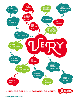
When it comes to cell phone providers I feel like you fall in one of two camps: iPhone users with AT&T (aka, the cool people) and Verizon users (aka, the lame people that will ask “Can you hear me now?” when they are not on their cell phone). Well, apologies for the perhaps offensive simplification of the matters but, let’s face it, Verizon has never had an ounce of cool to its name. Particularly among designers who, to my knowledge, all would rank the Verizon logo as one of the worst. And apparently Verizon has taken notice and is ready to make some identity and brand changes as it nears its first ten years in business.
 The logo change seems to be tied to this new campaign that revolves around the word “Very,” and while it’s not clear whether it will replace the popular “Test Man” and his army of technicians, this campaign is vastly different from anything Verizon has done. The campaign won’t launch until next July apparently, so I’m not sure how the samples I received are actually meant to be used, if they are print or banner ads or billboards or a combination of all.
 The brand visuals and messaging that Verizon will use are actually kind of clever and allow for a lot of alternatives and perhaps even more customization of messages. Not sure if the “Very” graphic will stay the same all the time, if so, it might become a little too tiring after a while; it might be interesting if they did different configurations of the circles but maybe not, since the whole identity and the logo itself is so full circles. Which brings us, well, full circle to the logo, which was, oddly enough, designed by London-based design firm johnson banks
 I want to like the new logo, even with its dumb “wireless cloud” nickname, simply because I detested the old one with all its angled gradients, specially as it mocked all of New York from its towering headquarters on Lower Manhattan. It is definitely much more interesting and dynamic and it is very in tune with the kind of work that johnson banks is known for — I must say that it’s nice to have an outsider design perspective on this American brand — but maybe it’s a little too soft and delicate. Overall it feels like a cohesive, and drastic, new look that should help Verizon capture some consumers from the cool camp.
via


No comments:
Post a Comment